[강의요약]프로그라피 공통세션 -FE
homework1-common
-
마진이나 패딩이 디스플레이나 해상도에 따라 변하지 않는게 좋다. (고정값으로 써라) 코드를 읽어보시기 바랍니다.
- 참고: 핀터레스트(디자인 레퍼런스 서치사이트)
- 목적: 내가 그릴 수 있는 도화지의 범위가 어디인가 (해상도와 그리드에서 답을 찾았었다.)
- 해상도: 해상도의 개념 설명, 해상도가 중요한 이유 container의 div 사이즈를 물어본이유
- 그리드: 단의 너비 단의 개수 사이 너비(GUTTER) 가 필요하다. (보통 12개 그리드 BUT 기획에따라 달라질 수 있다.)
homework2-common
- 숙제였던 세가지 레이아웃 중 2개 선택 후, 복습 겸 다시 만들어보시고
- 복습하신 2개 작업물을 반응형으로 만들어오세요!! 지난 번 숙제 복습 레이아웃 두 개 선택 후 반응형으로 제작 참고
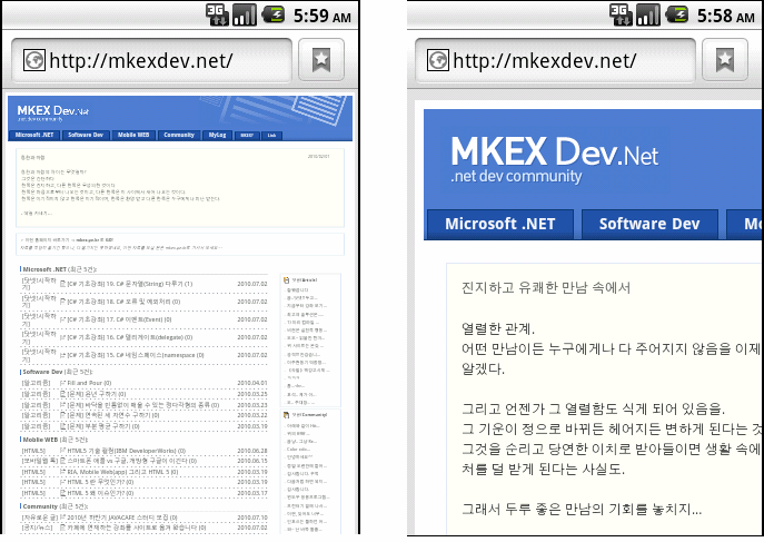
What is Responsive Web Design?
반응형 웹 디자인(Responsive Web Design)은 웹페이지를 모든 디바이스에서 잘 보이게 해준다.
같은 홈페이지더라도, 데스크탑, 스마트폰, 태블릿 등 기기에 따라 맞는 화면을 보여준다.
반응형 웹 디자인은 CSS와 HTML을 사용해서, 어느 화면에서도 잘 표시될 수 있게,
내용을 리사이즈, 숨김, 줄임, 늘임, 재배치 등의 동작을 수행해서, 화면에 적절히 표시한다.
아래의 예시를 통해 자세히 알아보자.
<!DOCTYPE html>
<html>
<head>
<meta name="viewport" content="width=device-width, initial-scale=1.0">
<style>
* {
  box-sizing: border-box;
}
.menu {
  float:left;
  width:20%;
  text-align:center;
}
.menu a {
  background-color:#e5e5e5;
  padding:8px;
  margin-top:7px;
  display:block;
  width:100%;
  color:black;
}
.main {
  float:left;
  width:60%;
  padding:0 20px;
}
.right {
  background-color:#e5e5e5;
  float:left;
  width:20%;
  padding:15px;
  margin-top:7px;
  text-align:center;
}

@media only screen and (max-width:620px) {
  /* For mobile phones: */
  .menu, .main, .right {
    width:100%;
  }
}
</style>
</head>
<body style="font-family:Verdana;color:#aaaaaa;">

<div style="background-color:#e5e5e5;padding:15px;text-align:center;">
  <h1>Hello World</h1>
</div>

<div style="overflow:auto">
  <div class="menu">
    <a href="#">Link 1</a>
    <a href="#">Link 2</a>
    <a href="#">Link 3</a>
    <a href="#">Link 4</a>
  </div>

  <div class="main">
    <h2>Lorum Ipsum</h2>
    <p>Lorem ipsum dolor sit amet, consectetuer adipiscing elit, sed diam nonummy nibh euismod tincidunt ut laoreet dolore magna aliquam erat volutpat.</p>
  </div>

  <div class="right">
    <h2>About</h2>
    <p>Lorem ipsum dolor sit amet, consectetuer adipiscing elit.</p>
  </div>
</div>

<div style="background-color:#e5e5e5;text-align:center;padding:10px;margin-top:7px;">© copyright w3schools.com</div>

</body>
</html>
<!DOCTYPE html>
<html>
<title>W3.CSS</title>
<meta name="viewport" content="width=device-width, initial-scale=1">
<link rel="stylesheet" href="https://www.w3schools.com/w3css/4/w3.css">
<body>

<div class="w3-container w3-green">
  <h1>W3Schools Demo</h1>
  <p>Resize this responsive page!</p>
</div>

<div class="w3-row-padding">
  <div class="w3-third">
    <h2>London</h2>
    <p>London is the capital city of England.</p>
    <p>It is the most populous city in the United Kingdom,
    with a metropolitan area of over 13 million inhabitants.</p>
  </div>

  <div class="w3-third">
    <h2>Paris</h2>
    <p>Paris is the capital of France.</p>
    <p>The Paris area is one of the largest population centers in Europe,
    with more than 12 million inhabitants.</p>
  </div>

  <div class="w3-third">
    <h2>Tokyo</h2>
    <p>Tokyo is the capital of Japan.</p>
    <p>It is the center of the Greater Tokyo Area,
    and the most populous metropolitan area in the world.</p>
  </div>
</div>

</body>
</html>
지난 숙제 복습 및 분석!
**신성환멘토님**
- HTML - 반응형으로 제작
- 각 html 별 CSS와 전체 CSS 따로 제작
- hw1_1.html
- hw1_1.css
- hw1_all.css
- 구성: nav 하나 메인 div 하나 서브 div 셋 footer 하나
- hw1_1.css
- .three-div-wrap
- 선택자로 div 따로 설정
- div:last-child, before 설정
- Q. display: inline-block ?
- 참조
Q. 사용하지 않는 선택자 정의한 이유?
- hw1_2.html
- hw1_2.css
- hw1_all.css
- 구성:
```html
```
- hw1_2.css
- .three-div-wrap
- 선택자로 div 따로 설정
- div:last-child, before 설정
Q. 사용하지 않는 선택자 정의한 이유?
**강민정멘토님**
HTML - 그리드를 12개로 쪼개어 정확한 비율로 제작
- HTML Form 자료를 보고 공부해오시기! 참고페이지
- HTML Forms 파트를 정독, 저는 5번 정독하고 가겠습니다!!… 옙…
정보: html과 css만 사용! 이번 숙제는 오픈소스는 제외. 참고페이지 미디어 쿼리 부분과 앞쪽 내용을 참고해서 공부!
HTML Forms
Form태그 안에 input 태그 3개를 이용하여 textbox 2개 + submit 버튼 1개를 구성한다.
The form Element
HTML Form 은 여러 종류의 input 을 받기 위해서 사용된다. HTML form 은 text field, checkbox, radio-button, submit button 등의 입력을 받는 element 들을 가지고 있다. form 은 select list, textarea, fieldset, legend, label 과 같은 element 들도 가지고 있다.
The input Element
가장 중요한 form element 중 하나는 input element 이다. input element 는 유저의 정보를 받는 데 사용되며 type 속성에 의해 여러가지로 변형될 수 있다. input element 는 text field, checkbox, password, radio button, submit button 등이 될 수 있다. 가장 흔하게 사용되는 input type들은 아래에 설명된다.
Text Fields
<input type="text"> 는 유저가 글을 쓸 수 있는 한 줄짜리 입력 필드를 생성한다.
<form>
First name: <input type="text" name="firstname"><br>
Last name: <input type="text" name="lastname">
</form>
주의 : form 태그 그 자체는 보여지지 않는다. text field 의 기본 너비는 20 글자를 수용하는 너비이다.
Password Field.
<input type="password"> 는 암호 필드를 정의한다.
<form>
Password: <input type="password" name="pwd">
</form>
주의 : 암호 필드에 들어가는 글씨들은 숨김표시가 된다. ( 별표 혹은 동그라미로 )
Radio Buttons
<input type="radio"> 는 라디오 버튼을 정의한다. 라디오 버튼은 유저가 여러개의 선택지 중 하나만 선택할 수 있도록 제한한다.
<form>
<input type="radio" name="sex" value="male">Male<br>
<input type="radio" name="sex" value="female">Female
</form>
Checkboxes
<input type="checkbox"> 는 체크박스를 정의한다. Checkbox 는 유저가 여러개의 선택지 중 0개 이상 ( 선택을 안 해도 되고, 여러개를 선택해도 된다. )을 선택할 수 있도록 한다.
<form>
<input type="checkbox" name="vehicle" value="Bike">I have a bike<br>
<input type="checkbox" name="vehicle" value="Car">I have a car
</form>
Submit Button
<input type="submit"> 은 제출 버튼을 정의한다.
제출 버튼은 데이터를 서버에 보내는 데 사용된다. form 의 action 속성에 명시된 페이지로 정보를 보내며 action 속성에 정의된 파일은 받은 정보를 바탕으로 무언가 작업을 한다.
<form name="input" action="html_form_action.asp" method="get">
Username: <input type="text" name="user">
<input type="submit" value="Submit">
</form>
HTML Form Tags
NEW는 HTML5 에 새로 소개된 tag 이다.
| Tag | Description |
|---|---|
| form | Defines an HTML form for user input |
| textarea | Defines a multiline input control (text area) |
| input | Defines an input control |
| label | Defines a label for an inputelement |
| fieldset | Groups related elements in a form |
| legend | Defines a caption for a fieldset element <fieldset> element |
| select | Defines a drop-down list |
| optgroup | Defines a group of related options in a drop-down list |
| option | Defines an option in a drop-down list |
| button | Defines a clickable button |
| datalist | Specifies a list of pre-defined options for input controls |
| keygen | Defines a key-pair generator field (for forms) |
| output | Defines the result of a calculation |
The select element
select element는 드롭다운(drop-down) 리스트를 정의합니다.
<select name="cars">
  <option value="volvo">Volvo</option>
  <option value="saab">Saab</option>
  <option value="fiat">Fiat</option>
  <option value="audi">Audi</option>
</select>
↓ 선택창은 아래에 있습니다.
optionelement는 선택할 수 있는 옵션을 정의합니다. 기본으로 드롭다운 리스트의 첫 번째 아이템이 선택되어집니다. 먼저 선택되어지는 아이템을 정의하기 위해서는 아래처럼selectedattribute를 사용합니다.
<option value="fiat" selected>Fiat</option>
sizeattribute를 사용하여 보이는 value을 갯수를 정의할 수 있습니다.
<select name="cars" size="3">
  <option value="volvo">Volvo</option>
  <option value="saab">Saab</option>
  <option value="fiat">Fiat</option>
  <option value="audi">Audi</option>
</select>
↓ 선택창은 아래에 있습니다.
multipleattribute를 사용하여 하나 이상의 값을 선택할 수 있도록 설정할 수 있습니다.
<select name="cars" size="4" multiple>
  <option value="volvo">Volvo</option>
  <option value="saab">Saab</option>
  <option value="fiat">Fiat</option>
  <option value="audi">Audi</option>
</select>
↓ 선택창은 아래에 있습니다.
The textarea Element
textarea element는 multi-line input field(a text area)를 정의합니다.
<textarea name="message" rows="10" cols="30">
The cat was playing in the garden.
</textarea>
rows attribute는 text area에 보여지는 라인 수를 명시합니다.
cols attribute는 text area의 넓이를 명시합니다. 명시합니다.
정보: 아래처럼 css를 이용하여도 textarea의 사이즈를 조절할 수 있습니다.
<textarea name="message" style="width:200px; height:600px">
The cat was playing in the garden.
</textarea>
The button element
button element는 클릭할 수 있는 버튼을 정의합니다.
<button type="button" onclick="alert('Hello World!')">Click Me!</button>
↓ 버튼은 아래에 있습니다.
정보: 브라우저마다 버튼의 기본타입이 다르기 때문에 기본 버튼의 type attribute를 항상 명시해줘야만 한다.
HTML5 Form Elements
HTML 5에서는 아래의 form element가 추가되었습니다.
datalistoutput
Datalist element
<datalist> element는 input element의 pre-defined 옵션의 리스트를 명시한다.
유저는 그들의 input data로 pre-defined option의 드롭다운 리스트를 볼 수 있다.
input element의 list attribute는 <datalist> element의 id attribute와 반드시 매칭되어야 한다.
<form action="/action_page.php">
  <input list="browsers">
  <datalist id="browsers">
    <option value="Internet Explorer">
    <option value="Firefox">
    <option value="Chrome">
    <option value="Opera">
    <option value="Safari">
  </datalist>
output element
<output> element는 스크립트에 의해 실행되는 계산의 결과를 표현한다.
<form action="/action_page.php"
  oninput="x.value=parseInt(a.value)+parseInt(b.value)">
  0
  <input type="range"  id="a" name="a" value="50">
  100 +
  <input type="number" id="b" name="b" value="50">
  =
  <output name="x" for="a b"></output>
  <br><br>
  <input type="submit">
</form>
오류 발생,,, 링크를 참조하세요!
↓ 요기에요!
homework2(private)
: 페이스북 클론코딩을 찾아 분석해본다.
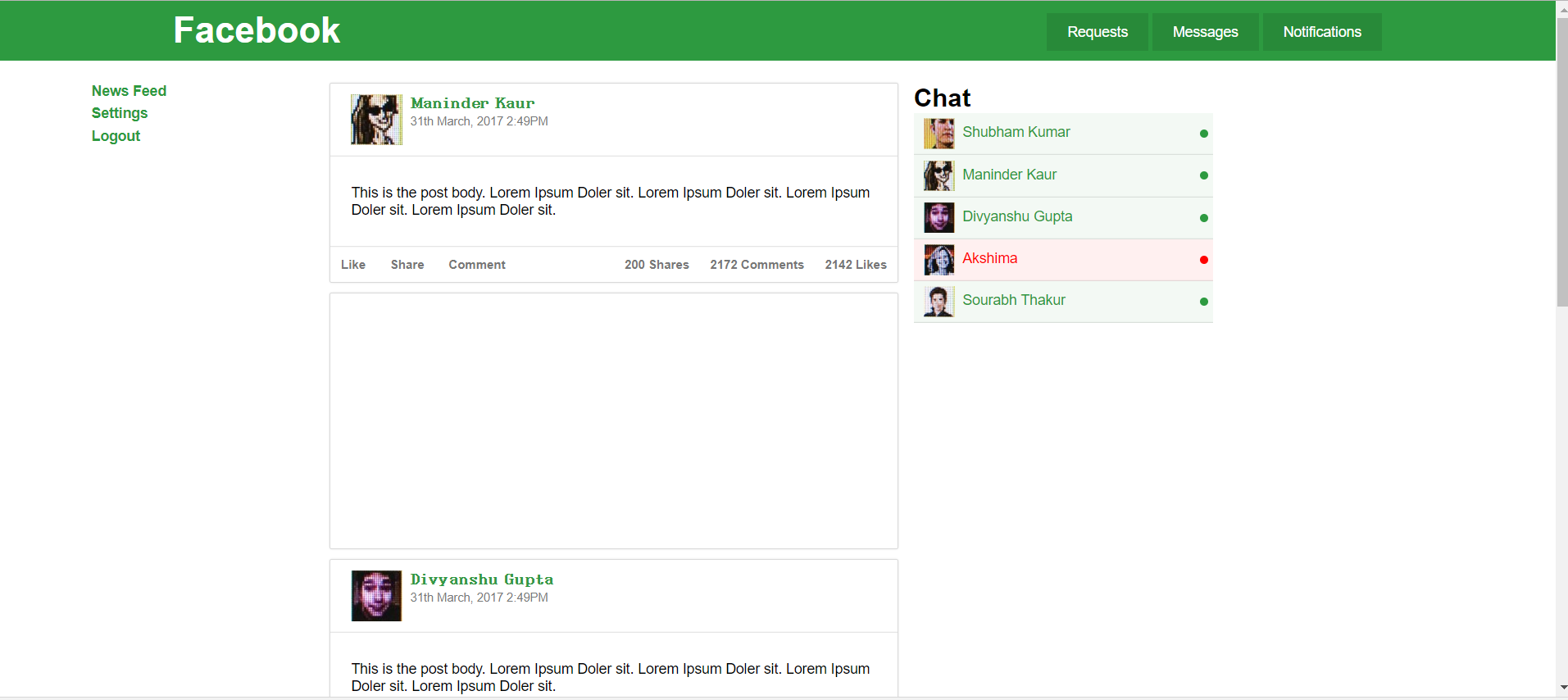
Dashboard
: 대시보드형태를 먼저 분석한다. 클론할 페이지는 아래와 같다.
처음에 나오는 meta 태그부터 분석해보자.
<meta name="viewport" content="width=device-width, initial-scale=1.0">
viewport는 모바일 브라우저가 파일을 렌더링하는 가상 ‘window’이다. 모바일 웹이 데스크탑 환경처럼 웹화면 전체를 자연스럽게 브라우징하는 풀브라우징을 지원하는 특징을 가져 뷰포트가 중요하게 여겨지기 시작했다. 즉, 작은화면의 모바일 단말기에 웹페이지를 모두 표시하려다보니 가독성이 상당히 떨어지는 것이다. 모바일 브라우저의 설정 - 데스크탑모드로 보기 를 누르면 알 수 있듯이 배율축소로 글자 및 이미지의 가독성이 현저하게 떨어져 뷰포트 메타태그를 이용하여 모바일웹에 최적화된 상태로 화면이 표시되게 하기 위함이다.
그래서 저 코드가 무슨 의미인데?
<meta name="viewport" content="width=device-width">
뒷 부분을 자르고 보면 위 태그의 내용은 뷰포트의 가로폭을 기본 값(페이지마다 다를 수 있다.)인 1024px이 아닌 모바일 단말기 장치의 가로폭으로 설정한다는 의미이다.(아이폰은 320px).
그럼 initial-scale=1.0은?
<meta name="viewport" content="width=device-width, initial-scale=1.0">
메타태크 속성표의 원문을 보면 아래와 같다.
initial-scale

The initial scale of the viewport as a multiplier. The default is calculated to fit the webpage in the visible area. The range is determined by the minimum-scale and maximum-scale properties.

You can set only the initial scale of the viewport—the scale of the viewport the first time the webpage is displayed. Thereafter, the user can zoom in and out unless you set user-scalable to no. Zooming by the user is also limited by the minimum-scale and maximum-scale properties.

Available on iPhone OS 1.0 and later.
즉, 초기 스케일은 1.0 즉 확대/축소 없는, 본 크기 그대로를 지정한다는 의미이다.
자세한 내용은 애플에서 제공하는 문서를 참조하기 바란다.Configuring the Viewport
스타일 지정
<link rel="stylesheet" href="assets/css/style.css"/>
<link rel="stylesheet" href="assets/css/admin.css"/>
<style>
    .box{
        background: rgba(255,255,255,1);
        padding: 10px 20px;
        border-radius: 2px;
        box-shadow: 0px 0px 15px 5px rgba(0,0,0,0.4);
    }
</style>
이 부분은 style.css와 admin.css를 스타일로 지정하고 .box를 id로 쓰는 녀석은 저렇게 스타일하자는 의미이다.
<script async src="//pagead2.googlesyndication.com/pagead/js/adsbygoogle.js"></script>
<script>
(adsbygoogle = window.adsbygoogle || []).push({
google_ad_client: "ca-pub-8894073675575663",
enable_page_level_ads: true
});
</script>
이 부분은 링크를 따라들어가면 자바스크립트 파일을 다운받게 되는데 구글광고를 넣는 코드이다… 필요하면 읽어보시길 ^^…
진짜 분석시작
바디코드만,,, 약 300줄에 달하는 꽤나 복잡한 구조이다. 큰 div하나 씩 붙잡고 세부 내용을 파헤치도록 해보자.
    <div class="header no-shadow">
        <div class="container-fluid">
            <div class="row">
                <div class="col-sm-4">
                    <div class="logo">
                        <h1>Facebook</h1>
                    </div>
                </div>
                <div class="col-sm-8">
                    <ul class="header-menu pull-right">
                        <li><a href="#" class="">Requests</a></li>
                        <li><a href="#" class="">Messages</a></li>
                        <li><a href="#" class="">Notifications</a></li>
                    </ul>
                </div>
            </div>
        </div>
    </div>
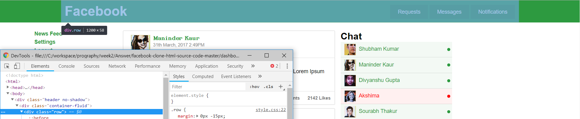
DIV 파헤치기(1) - 최상단 컴포넌트
먼저 <div class="header no-shadow">의 세부내용을 펼쳐보자. 총 5단계의 div로 이루어져 있으며 아래 사진 부분이다. 즉, 최상단 컴포넌트를 구성한다.
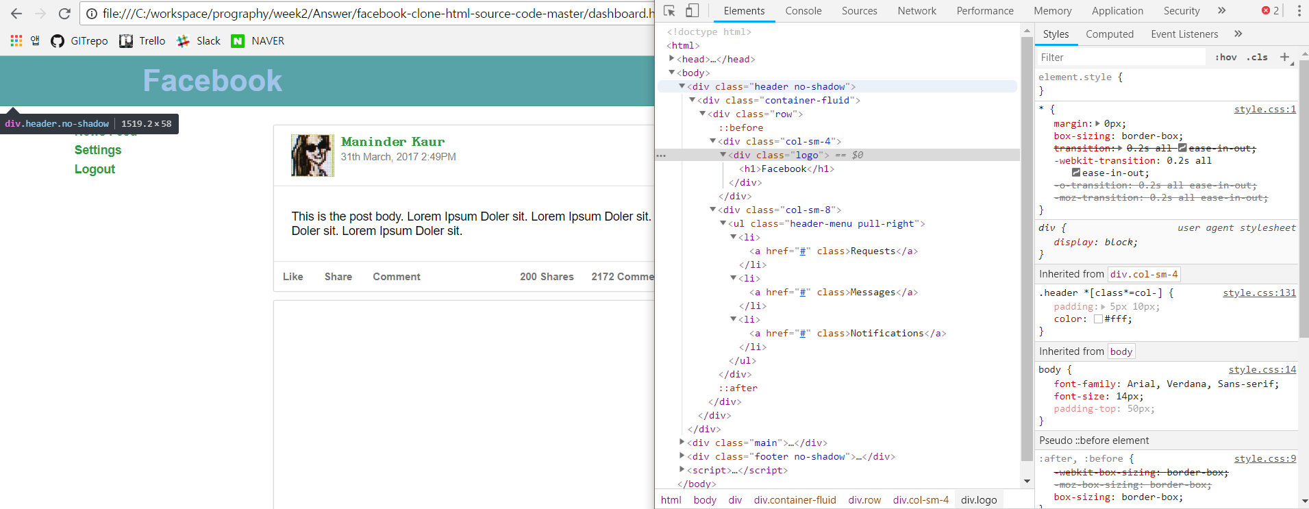
css는 style.css의 .header과 admin.css의 .no-shadow를 적용했다.
- div의 너비는 최대
- 색깔은
#2d9a40 - 위치는 고정이며
top,left속성을 이용해 문서로부터 태그의 거리를 지정했다 참조.z-index란 쉽게 이해하면 그림의 순서로 수치가 높을수록 앞에 위치하게 된다. (3차원 좌표로 이해하면 쉽다.)box-shadow는 말 그대로 그림자를 의미하며 no-shadow 속성을 이용하여 그림자를 제외했다. 자세한 내용은 MSDN을 참조하자.
/* style.css */
.header {
    width: 100%;
    background: #2d9a40;
    position: fixed;
    top: 0px;
    left: 0px;
    z-index:999;
    box-shadow: 0px 5px 5px 0px rgba(0, 0, 0, 0.45);
}
/* admin.css */
.no-shadow{
    box-shadow:none;
}
DIV 파헤치기(1-2) - container-fluid
아래 그림에 대한 부분이다.맨 처음에 fluid 단어가 오타인줄 알았다… 유동체 라는 의미인데 저렇게 구성한 이유를 잘 모르겠다.
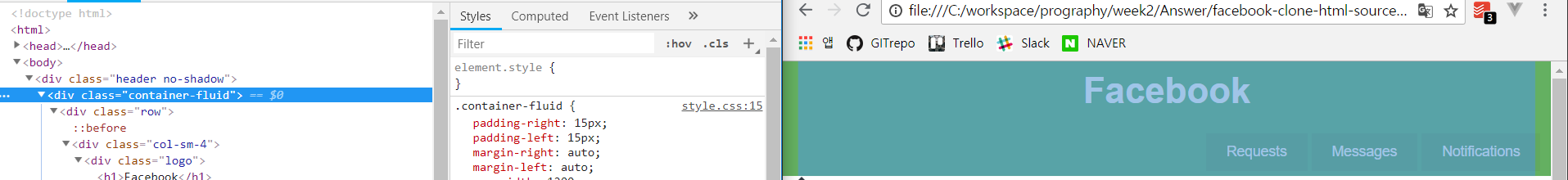
Q. div 구조를 저렇게 만든 이유?
DIV 파헤치기(1-3) - 실제 구성요소
<div class="row">
    <div class="col-sm-4">
        <div class="logo">
            <h1>Facebook</h1>
        </div>
    </div>
    <div class="col-sm-8">
        <ul class="header-menu pull-right">
            <li><a href="#" class="">Requests</a></li>
            <li><a href="#" class="">Messages</a></li>
            <li><a href="#" class="">Notifications</a></li>
        </ul>
    </div>
</div>
위는 실제 소스이며 아래는 각 div가 차지하는 영역이다.
가장 먼저, row div는 로고와 ul, li 태그를 담고있는 컨테이너이다.
Q. div 구조를 저렇게 만든 이유?
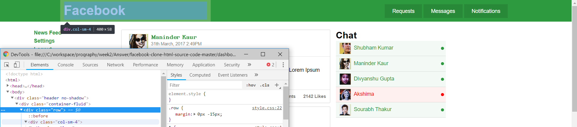
div의 크기를 정해주는 div이다..? 세션에서 배운 것과 비슷하게 GRID를 12개로 나누어 개발한 것으로 보인다.
/*style.css*/
.col-sm-4 {
  width: 33.33333333%;
}
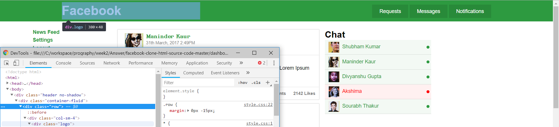
다음 logo div 태그는 facebook 이라는 글자를 담고있다. 일반적으로 버튼으로 제작하여 클릭할 경우 홈으로 보낸다.
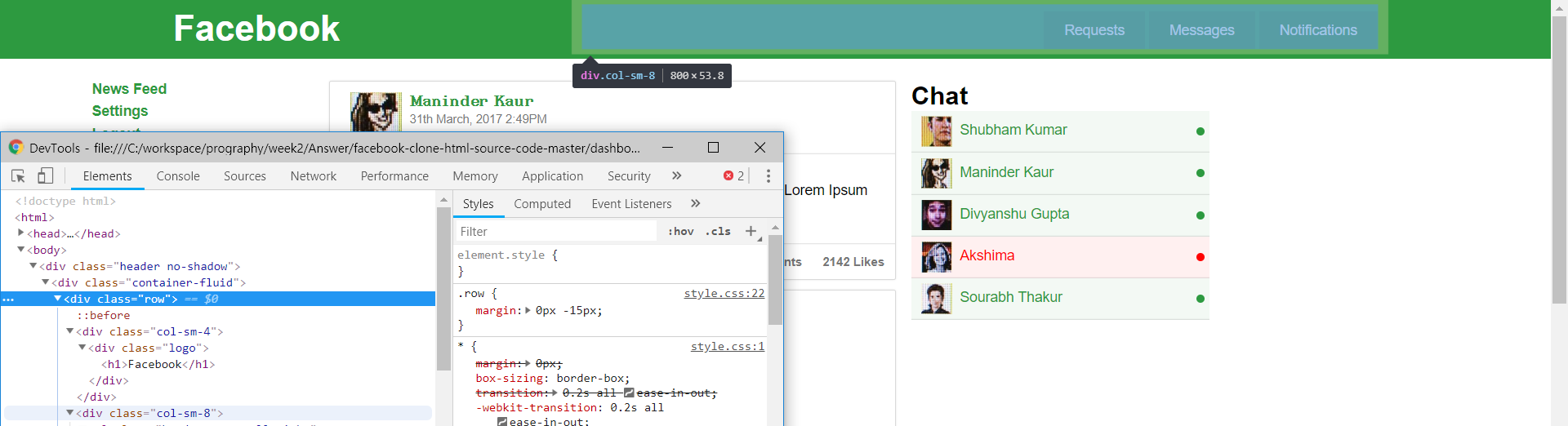
다음 col-sm-8 div 태그는 2/3 만큼의 width를 차지하는 div이며 3가지 버튼을 담는 컨테이너이다.
DIV 파헤치기(2) - 메인 컴포넌트
매우 큰 컴포넌트이기 때문에 중복되는 부분(Chat Component User, Post, others)은 하나만 남겨두었다. 아래 코드를 보자.
<div class="main">
<div class="container-fluid">
<div class="col-sm-3 left-sidebar">
<ul>
<li><a href="./dashboard.html" class="active">News Feed</a></li>
<li><a href="./settings.html" class="active">Settings</a></li>
<li><a href="./index.html">Logout</a></li>
</ul>
</div>
<div class="col-sm-6">
<div class="post col-sm-12" id="post_1">
<div class="row post-heading">
<div class="col-sm-12">
<a href="profile.html">
<img src="assets/imgs/2.jpg" class="profile-picture pull-left"/>
<span class="post-user-name">Maninder Kaur</span><br/>
<small class="post-date text-mute">31th March, 2017 2:49PM</small>
</a>
</div>
</div>
<div class="row post-body">
<div class="col-sm-12">
This is the post body. Lorem Ipsum Doler sit. Lorem Ipsum Doler sit. Lorem Ipsum Doler sit. Lorem Ipsum Doler sit.
</div>
</div>
<div class="row post-action">
<ul class="post-action-menu">
<li><a href="javascript:void(0);" class="text-mute" onclick="like(1);">Like</a></li>
<li><a href="javascript:void(0);" class="text-mute" onclick="share(1);">Share</a></li>
<li><a href="javascript:void(0);" class="text-mute" onclick="comment(1);">Comment</a></li>
<li class="pull-right"><a href="#" class="text-mute"><span id="post_like_count_1">2142</span> Likes</a></li>
<li class="pull-right"><a href="#" class="text-mute"><span id="post_comment_count_1">2172</span> Comments</a></li>
<li class="pull-right"><a href="#" class="text-mute"><span id="post_share_count_1">200</span> Shares</a></li>
</ul>
</div>
</div>
</div>
<div class="col-sm-3 chat-users">
<div class="row">
<h3>Chat</h3>
</div>
<div class="row">
<div class="col-sm-12 chat-user online">
<a href="#">
<img src="assets/imgs/1.jpg" class="pull-left"/>
Shubham Kumar
</a>
</div>
</div>
</div>
</div>
</div>
<div class="footer no-shadow">
<div class="container-fluid">
<div class="row">
<div class="col-sm-12">
© Facebook 2017.
</div>
</div>
</div>
</div>
<script>
function like(id){
var elem = document.getElementById("post_like_count_"+id);
var count = parseInt(elem.innerHTML);
elem.innerHTML = count+1;
highlight(elem);
}
function share(id){
var elem = document.getElementById("post_share_count_"+id);
var count = parseInt(elem.innerHTML);
elem.innerHTML = count+1;
highlight(elem);
}
function comment(id){
var elem = document.getElementById("post_comment_count_"+id);
var count = parseInt(elem.innerHTML);
elem.innerHTML = count+1;
highlight(elem);
}
function highlight(elem){
elem.style.color = "red";
elem.parentElement.parentElement.style.transform="scale(1.5)";
setTimeout(function(){
elem.style.color="";
elem.parentElement.parentElement.style.transform="scale(1)";
},300);
}
</script>
</body>
최상단(녹색) DIV를 분석한 결과 생각보다 구조가 복잡하게 되어있다.
vue
directive
: VUE에서 제공하는 특수속성으로 v- 라는 접두어가 붙어있으며 렌더링된 DOM에 특수한 반응형 동작을 한다. if문, for문, eventListener, 데이터 최신화 등 예제를 볼 수 있다.
component
: 컴포넌트란 본질적으로 미리 정의된 옵션을 가진 Vue 인스턴스. 컴포넌트를 정의 후 인스턴스를 생성하여 사용한다.
댓글남기기